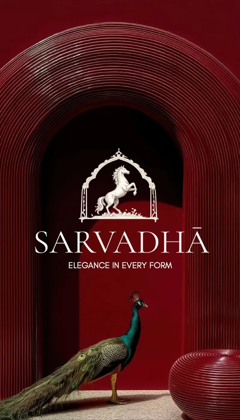
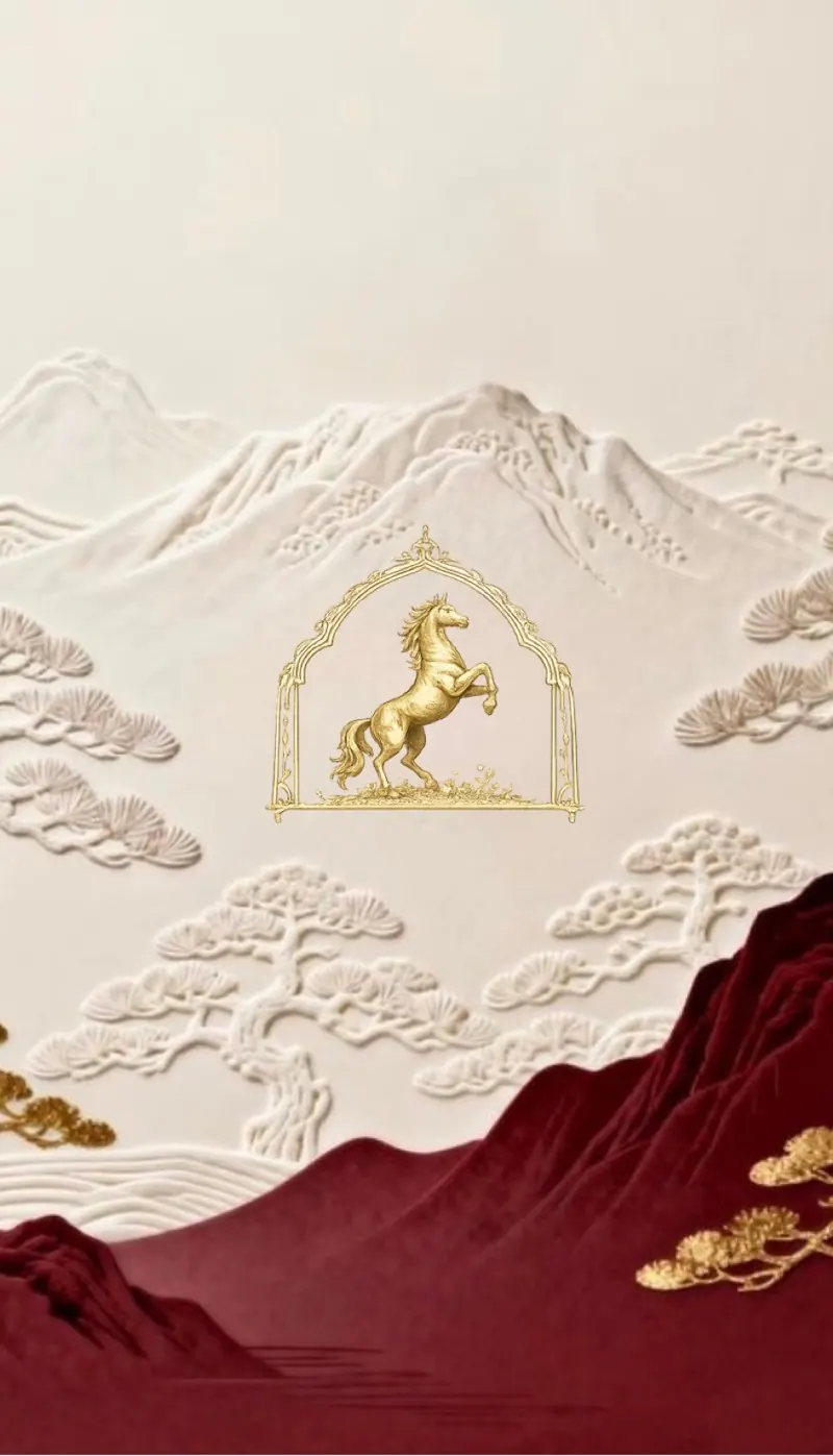
Sarvadhā: elegance in every form
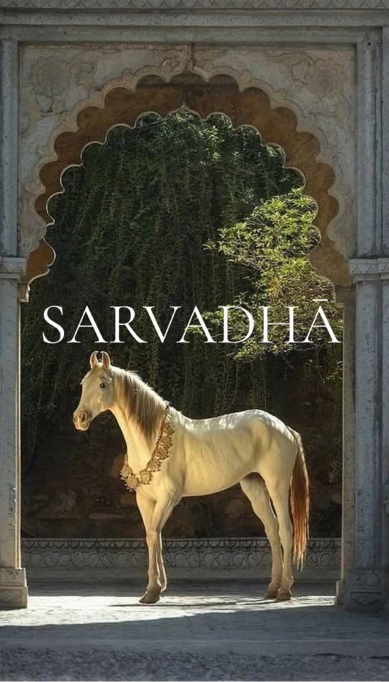
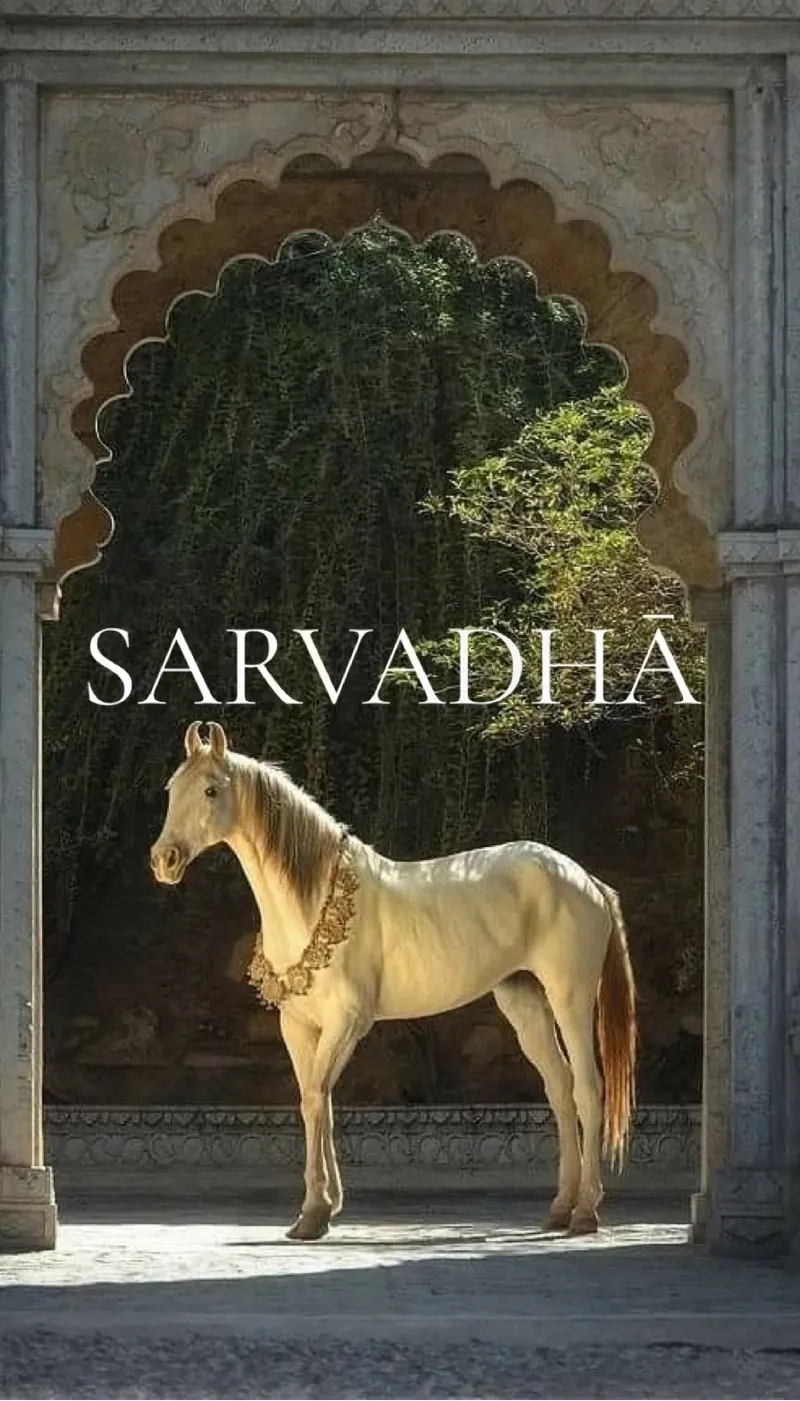
A heritage label in a market addicted to trends. Its name is Sanskrit for completeness, elegance in every form, and that one idea became the brief for everything around it. The world draws on India’s architecture, nature and royal symbolism, and holds to three rules:
- Timeless over trending.
- Craft over noise.
- Culture worn, not displayed.
What we made
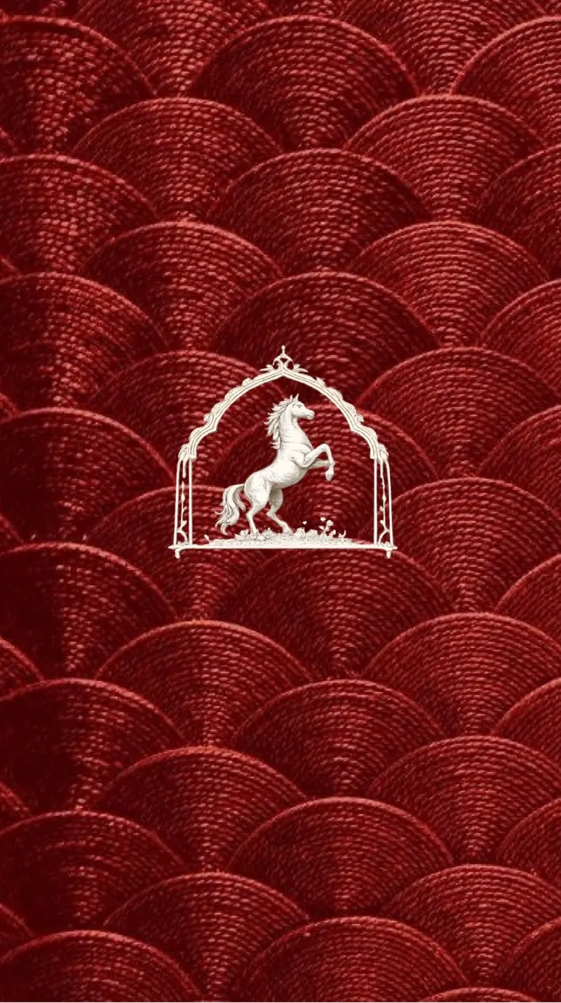
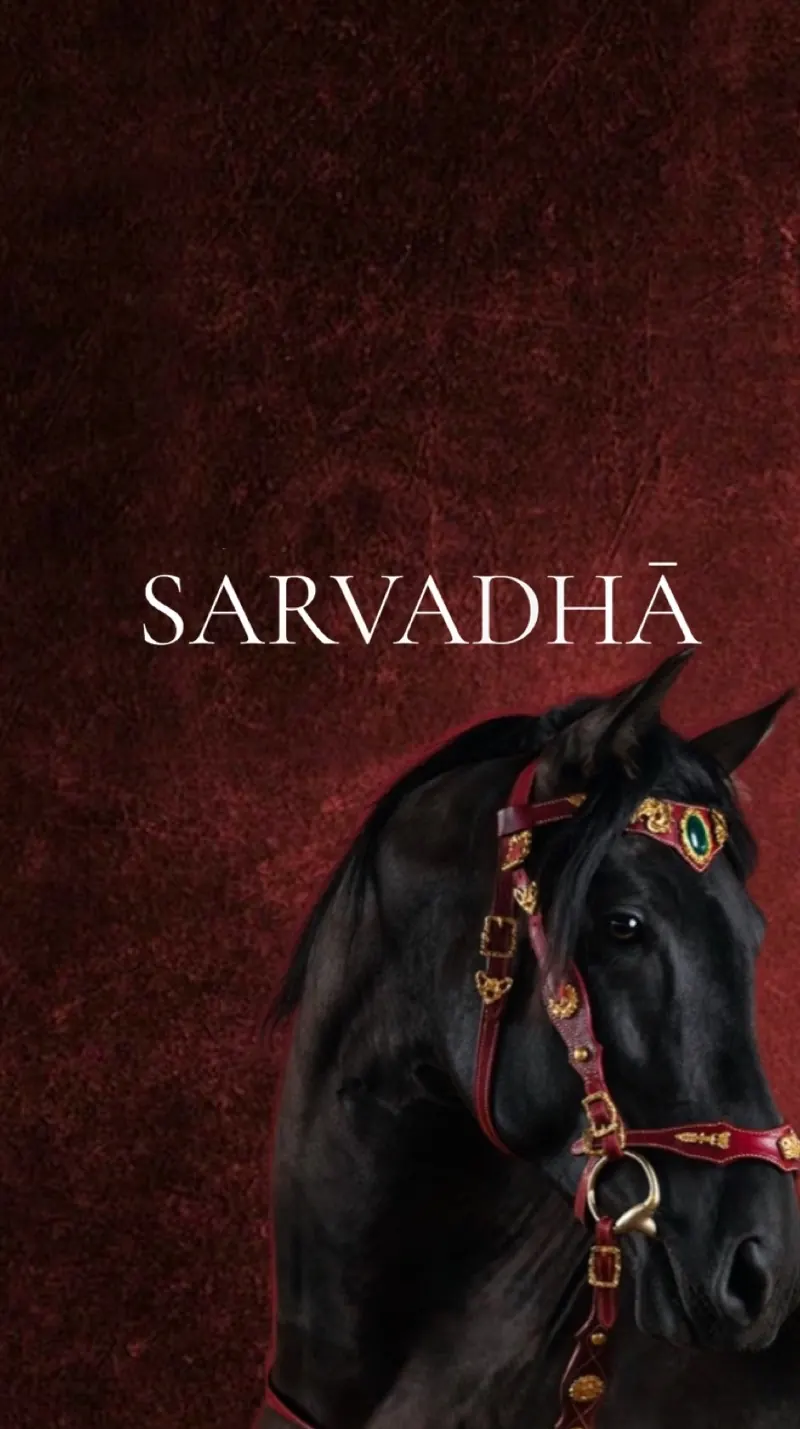
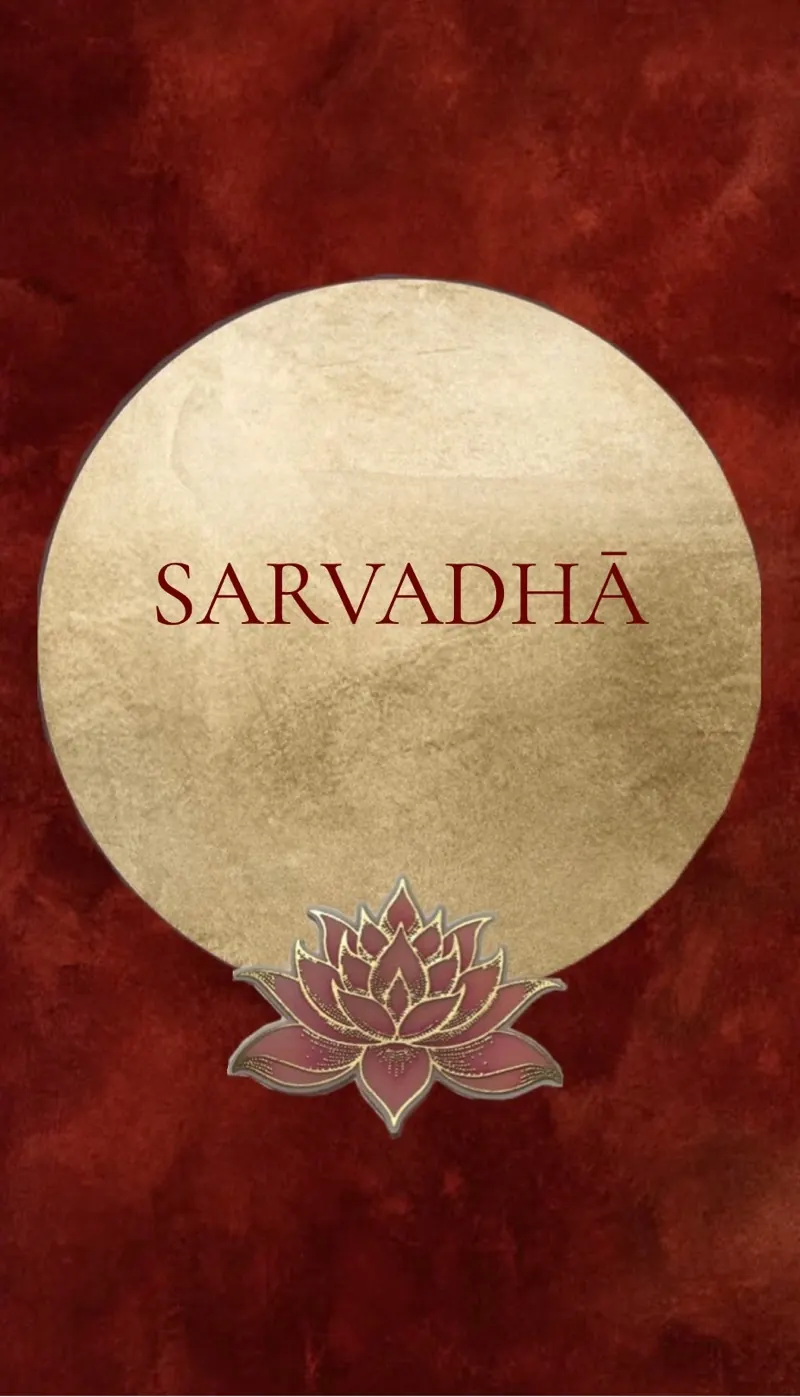
Emblem and wordmark, pattern, packaging, stationery and campaign imagery, designed as one system. A customer meets the same world on a box, an envelope or a post.
- Crimson
- Oxblood
- Ivory
- Antique gold
- Ink
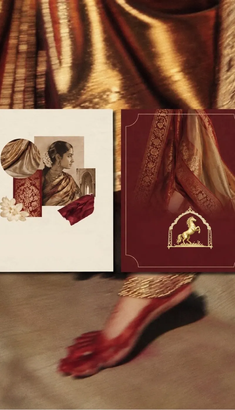
Read how the Sarvadhā world was built.
From the box to the set
A product photo shows what you sell. A world shows who it’s for, and it gives every later piece of work, from a shoot to an ad, somewhere to belong. Because the same team carries the world onto set, the campaign looks like the packaging: one of our sets, a red velvet theatre, was hung with framed Sarvadhā artwork. See campaign shoots, website design, or the brand world on the home page.